“How wonderful the colour yellow is. It stands for the sun ☀️”
– Vincent Van Gogh
You must be thinking why I started with a quote. Well, the festival of colours (Holi) is here in India and as the popular meme goes “We can’t keep calm” about it. Although, the celebrations will not take place in a similar fashion because of COVID, yet one thing we can all agree on is the importance of role of colours (in our lives and marketing). Colours have made the world a better place, has made the idiot box more entertaining, and made iMacs a necessity.
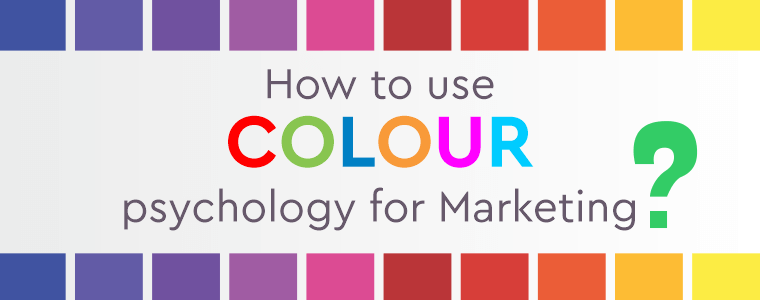
In today’s world, for a marketer, it is a must to know the psychology of colour in marketing and branding. In fact, we can say that knowing the psychology of colors and making them work for you is critical to maintain an edge over your competition. A brand is known for what they stand for and that must reflect in the tone, voice, and personality of the brand, which is where colours play a crucial role.
What is the meaning of colour psychology?
Colour psychology is the study of the effects of colours on human behaviour. Different colours influence our emotions in seemingly different ways, covertly, hence, making it important to understand the colours you should/should not be using in your content.
Psychology of colours in marketing and advertising
Have you ever wondered why some brands are stuck in your mind while you never even bother about some?
Yup, you guessed it right. It is because of the colours they use.
As already mentioned, colours affect perception of brands. To get a clear picture of colour theory in marketing, it is better to understand which colour evokes which emotion, so you know how to make your landing pages and conversions more effective than before.
Red: Red is one of the more popular colours used for brands due to its attention-grabbing nature. Generally associated with passion, energy, love, warmth, and intensity. A few examples you might remember is the logo of Pizza Hut, Coca-Cola, and RedBull.
Blue: Usually associated with calmness, tranquility, serenity, peace, and relaxation. It is also used to build trust. A few brands you might recall Intel, CISCO, and Samsung.Green: Associated with positive characteristics such as harmony, balance, wealth, and sustainability (eco-friendliness). Fun Fact: Neil Patel used a green CTA for his site QuickSprout.com and saw huge
success. (Source: NEILPATEL). Some of the better-known brands include Land Rover, Starbucks, Tropicana, and John Deere.
Purple: It has long been associated with royalty, luxury, mystique, magic imagination, and spirituality. A quick look at RichDad.comand you will realize the entire website is filled with white spaces with CTAs in purple. In essence, this is the world of fantasy. Some of the well-known brands using purple are Taco Bell, Cadbury, FedEx, and Hallmark.
Orange: Orange is associated with youth, friendliness, affordability, vitality, and humor. When we think about how brands use colours to reinforce their identities, think of Fanta. You will most likely associate it with the bright orange colour. Fun fact, 70% of Fanta’s sales are due to the orange bottles (Source: bereavementpractitioners.org)
Yellow: As Van Gogh said “How wonderful the colour yellow is. It stands for the sun”. So you can already understand the characteristics associated with the colour. Energy, youth, playfulness, warmth, and cheerfulness are usually associated. At times, it is associated with danger too. Some well known brands using yellow are Shell, Post-it, and Pringles.
Pink: Pink as a colour has been historically associated with products that are feminine in nature. Usual characteristics that are associated with pink are fun, sweet, delicate, romantic, and peaceful. Extremely popular for bakeries and beauty products. For example, the cosmetic brand NYKAA has the entire logo in pink.
Black: When we try to understand what colors evoke what emotions, black is of primary importance. Black is regarded as powerful. Popular associations with black include items which are luxurious and powerful in nature. Other associations include elegance, class, and mystery. Louis Vuitton, Gucci, Chanel, Prada are some brands that you would be familiar with.
White: The colour of purity. Most associations are to deal with more pleasant characteristics such as peace, cleanliness, blankness, and simplicity. Think of Tesla, Vans, and Volkswagen.
How colour impacts branding?
The purpose of branding is to create a distinguishable perception for a brand. This messaging is where colours play a crucial part. If we are looking at the psychology of colours in business, the IBM has a vibrant set of horizontal blues running across the three letters. The choice of blue has been used to represents the strength and dominance of the organization in today’s world. The capitalization of the letters is used to express the authority of the organization in the marketplace. If we have to talk about the impact of colour on marketing, we have to talk about McDonald’s. McDonald’s has the dark red hue in the background, playing a psychological trigger for inducing appetite, while the golden arches in rich yellow are meant to trigger cheeriness and optimism. The clown, Ronald McDonald, wears an attire of similar colours, making everyone identify with McDonald’s at a psychological level.
Now, let’s talk about the logo of FedEx. In case, you still haven’t looked at it close enough, the space between “E” and “X”, is a hidden arrow, representing their fast delivery service. The colours chosen for the logo were purple and orange, representing prosperity and prestige.
Marketers are increasingly using colours to their advantage, leveraging the power of colours for optimizing conversions. For a moment, let us look back at the biggest giants in the beverage industry: Coke v/s Pepsi. Coke uses a bright red colour. Associations include power, excitement, passion, and a trigger for appetite.
Now, let’s have a look at Pepsi. The logo of Pepsi is blue, red, and white, in mixed proportions. With so many colours providing different triggers to the brain, the messaging is lost, as all the colours provide different triggers. This is one of the places Pepsi loses out to Coke, apart from several other marketing campaigns that has made Coke the brand it is today.
Best Colour For Conversions and CTA’s
While it might seem like there is a perfect colour to go to, to increase conversions and sales, there isn’t. It all depends on the buyer’s journey. If the buyer is in the initial stages of the buyer’s journey, then a red CTA which triggers the buyers to take immediate action, might not be your best bet. Colours like green and orange are likely to perform better. The colours should also work well with your brand.
To provide an example, Tesla’s CTA – Order Now is in white. Keep in mind, this is a brand that deals with items in luxury. However, the brand voice that echoes through their website is of a brand that has renewed energy, vision, and is for the youth.
Your CTA’s should reflect your brand voice, identity, and your understanding of the buyer. Mismatches can happen. Only by trial and error can you understand what colour combinations work well for your brand and which does not.
Whether it be a logo, landing page or a CTA, the right colours make a difference. A lot of difference. Colours influence perceptions and perceptions influence sales. Colours convey more to us than we think. They represent culture, vision, and values of an organization. Having the right colours work for your brand is essential, otherwise it might just get lost in the ocean of brands that are present out there.
Want to connect better with your customers? Let’s discuss